TOUCH CARD BY MASTERCARD
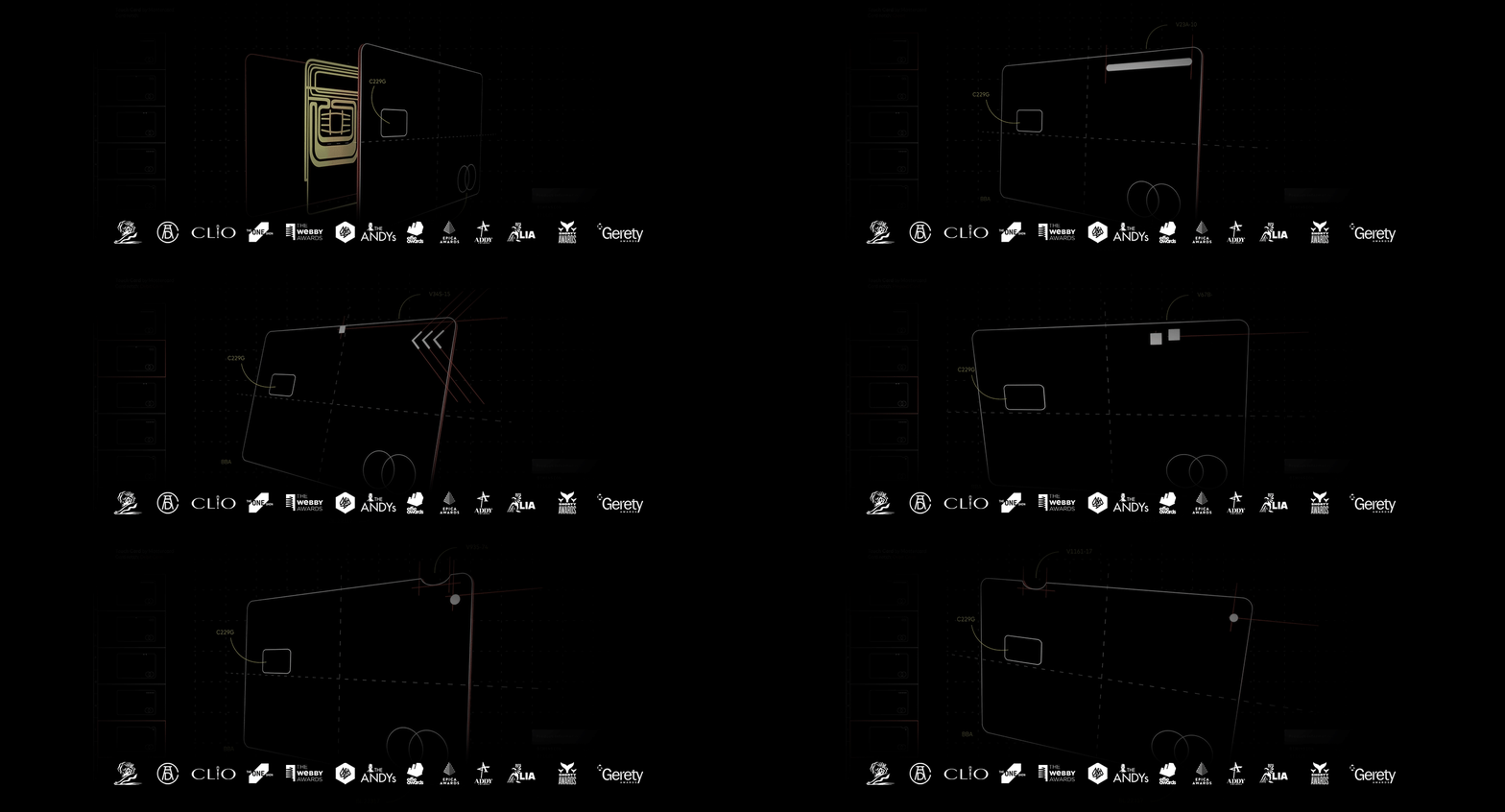
Mastercard Introduces Accessible Card Design for Blind Users. The new Touch Card uses distinct notches to help distinguish between a debit, credit, and prepaid card. The mission of the Touch Card campaign is summed up in our tagline, “A world designed for all of us, is Priceless.” Not only did the Touch Card introduce a new standard for financial inclusion, but our 360° campaign also reinvented the way we use a wide range of advertising media to reach our demographic on their terms.
A WORLD DESIGNED FOR ALL OF US IS PRICELESS.
To get the Touch Card into the hands of those who need it most we showed the world what was possible when designing a unique campaign tailor-made for the partially sighted and blind.
THREE DISTINCTLY SHAPED NOTCHES HELP PEOPLE TELL THE DIFFERENCE
Touch Card is an accessible system of payment cards with unique, tactile notches so anyone can identify their credit, debit, and prepaid cards with just a touch. Rounded for debit, squared for credit, and triangular for prepaid.
ACCESSIBLE DIRECT MAIL
When the visually impaired receive their card in the mail, they’ll recognize the envelope, so it’s easy to identify as The Touch Card itself. This accessible design system uses notches to indicate which of the three different cards they’re receiving in the mail. The inside material was designed with a voice chip technology that plays Mastercard’s Sonic melody and walks new card holders through the next steps of registration, usage and more.
ACCESSIBLE PAYMENT GUIDE
One of the biggest issues for blind people is actually locating the card reader, so we designed an accessible guide to help their hand from the edge of the payment counter to the machine.
3D DIRECTIONAL STORE EXPERIENCE FOR RADIO
For a better experience, listen to the radio spot with stereo headphones.


